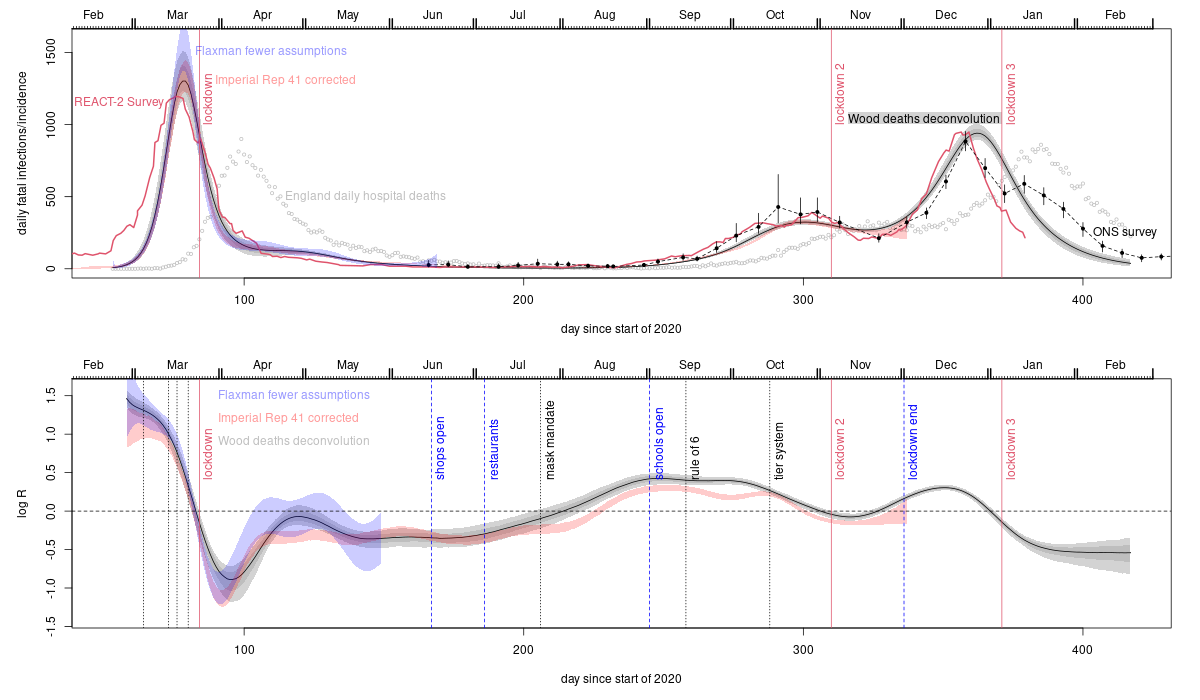
The grey uncertainty bands with a black central curve are from this Biometrics paper which applies a deconvolution method to obtain the trajectory of fatal infections from the daily deaths data shown as grey circles. The blue uncertainty bands are from applying the model based approach of Flaxman et al. (2020, Nature 584, 257-261) to the death data with the modification that how and when R changed is estimated from the data (Flaxman et al. assumed they knew the how and when part, and only needed to estimate how much - see Biometrics paper). The red uncertainty bands are from repeating the analysis in Imperial college covid response team Report 41, again estimating rather than assuming how and when R changes, and also correcting some discrepancies with the literature as described in this PLoS1 paper. This approach uses hospital, death and randomized testing data (the model assumes slowly improving infection fatality rate over time - allowed for in the plot rescaling). The remaining two data sources are much more direct measurements based on two independent large scale unbiased statistical sampling surveys. The red trajectory is from the REACT-2 study. Subjects with Covid antibodies from the study's representative random sample were simply asked when their symptoms started, to give the trajectory of numbers getting first symptoms each day. This is then lagged by 5 days to give daily infections, consistent with the average 5-6 days from infection to first symptoms in the literature. The black dots with confidence bands joined by dashed lines are ONS incidence reconstructions based directly on their Covid surveillance survey.
The vertical dotted lines on the lower plot show times of various interventions. Before lockdown 1 these are: public information campaign, self isolation, home working, school closures. The dip and recovery in R after lockdown 1 is a simple arithmetic averaging effect expected if the population is split into low R (locked down) and higher R (key worker/health service) components. Initially infections are mostly in the low R sub-population, giving a low average R. Over time the proportion of infections in the higher R sub population obviously climbs, leading to a higher average R. Not allowing for this effect is what messes up the original uncorrected Flaxman and Report 41 analyses. The tendency for the direct ONS and REACT-2 measurements to suggest earlier infection peaks than the analyses based on fitting deaths is to be expected. Most deaths are in the elderly with lower contact rates - sub populations with lower contact rates peak later than the whole population. So fatal infections are likely to peak later than infections overall.
Most of the push back against what these relatively high quality data sources imply is some variant of: but in countries all over the world deaths and cases were increasing before lockdown and only came down after lockdown. Intuitively this seems like strong evidence. But in reality the pattern is inevitable whether or not lockdown was the cause of the turn-around. Lockdowns are drastic measures of last resort. No government would impose them if cases and deaths were not increasing, and as the last resort measure they are the last intervention before cases and deaths start their inevitable eventual decrease. Hence the increase-lockdown-decrease pattern in cases and deaths is as inevitable as it is irrelevant. What matters is what the rate of infection - which precedes identification as a case or death - was doing. At least for the UK, the data indicate that it was in substantial decline well before lockdown. Another argument from a statistician who really should know better was basically: I am sceptical of all claims about causality made from the data. This scepticism is entirely reasonable with regard to many causal claims, but not for ruling out a cause because it came after the supposed effect. At that point scepticism is simply cop-out. Another reason for the belief that lockdowns were essential stems from mathematical modelling results. The models concerned have not been validated for making the sort of predictions required to draw conclusions about whether lockdowns were necessary, and there are good reasons to expect poor predictive performance, including the neglect of most person to person variability in contact rates and susceptibility as reviewed in this pre-print. For example, the SAGE/SPI-M modelling for the omicron wave suggested that lockdown was needed to avoid catastrophe: it wasn't - further evidence that the lockdown effect has been overstated. The UK data, like the Swedish data, imply that lockdowns were not what turned the infection waves around.
The death deconvolution (grey band) analysis was produced for lockdown 1 in early May 2020, when the preprint describing it was sent to a contact on SAGE, and received some media coverage. The basic result for lockdown one has not changed. A September 2020 revision of the pre-print included the relaxed Flaxman model analysis (and one of the authors was emailed about it). The re-doing of Imperial Report 41 was completed in early February 2021, and sent to the Imperial group when the preprint was posted on medarxiv. The first paper was very difficult to get published. JRSSC, Nature and Nature communications rejected it without peer review. At PLoS1 it was subject to what I felt was the least intellectually honest review process I have ever encountered, before I eventually pulled it and sent it to Biometrics, where pre-pandemic standards still seemed to apply. No reviewer ever argued that the result or analysis was incorrect. For most of 2020 the google scholar record for the pre-print pointed not to the arXiv pre-print server, but to the extreme right Daily Stormer (google do not usually index them). The paper features in an article on fullfact.org, who declined to correct substantive errors in their reporting of it and two papers on infection to death distributions, nor to correct their own misleading 'analysis' of lockdown efficacy (their email defence of which relied on a statement that if true means that the central limit theorem is false). The peer reviewed version of the redoing of report 41 is not indexed by google scholar or web of science, unlike all the other papers in the same PLoS1 issue that I have checked: this means that readers of the published version of report 41 are unlikely to find it, and gives the impression that it is an un peer reviewed pre-print (a week or so after I wrote this in mid February 2022, and 5 months post publication, WoS and GS both indexed the paper). On a brighter note, the Spectator, whose approach to data has been much better than most, did take the work seriously: see this article. The House of Commons Science and Technology Committee also published this written evidence.
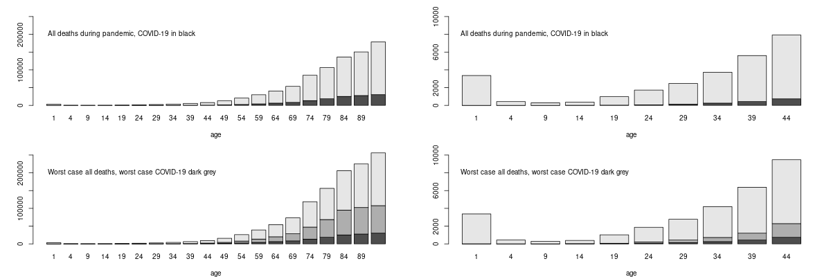
The bottom row shows what would have happened under the worst possible scenario suggested without suppression, of half a million Covid deaths (based on the assumptions that implied a catastrophe for the Swedish policy that in fact never happened, so unlikely to be over-optimistic). Dark grey bars are then Covid (with the black portion what actually happened). Anyone who considers Covid to have been a bigger risk to them over the pandemic than the other risks they face, should probably think through why they believe that the risks that kill more people of their age do not apply to them, while the Covid risk does. Moving forward, vaccination has further reduced your risk of death if you get Covid by a factor of 20 or so. PHE analysis suggests similar levels of vaccine efficacy in clinically vulnerable groups, with even the immunosuppressed showing only a small drop in efficacy.
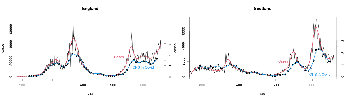
I have scaled things so that cases and ONS measurements match on average from day 450-500 (day 1 is 1st Jan 2020). If cases were really proportional to the number of people with Covid then the scaled case and ONS measurements should be on top of each other (with the red and blue smoothed versions being very close). They're not because there is really no good reason to expect detected cases among people who chose to get tested, or were told to by track and trace, to be proportional to the total number of infections. There is some relationship of course, as the plot shows. It's just not close enough that it makes any sense to use cases for management, when you have actual measurements.